Colby College Website Redesign: Improving the Admissions Funnel and the Prospective Student Experience
BACKGROUND
Colby College needed a new Admissions website to increase admissions from prospective first-year and international students.
As the lead UX Architect, I began the project by traveling to Colby’s campus in Waterville, Maine with my Project Manager and Content Strategist to spend three days with the people closest to the admissions experience:
Admissions Staff
Counselors
Faculty
Students who had just gone through it themselves
My role was to lead the UX research and site architecture, turning a lot of perspectives, a lot of content, and a lot of data into a simpler path for prospective students.
MY APPROACH
STARTING WITH THE PEOPLE WHO KNEW IT BEST
We turned three days on campus into a working session.
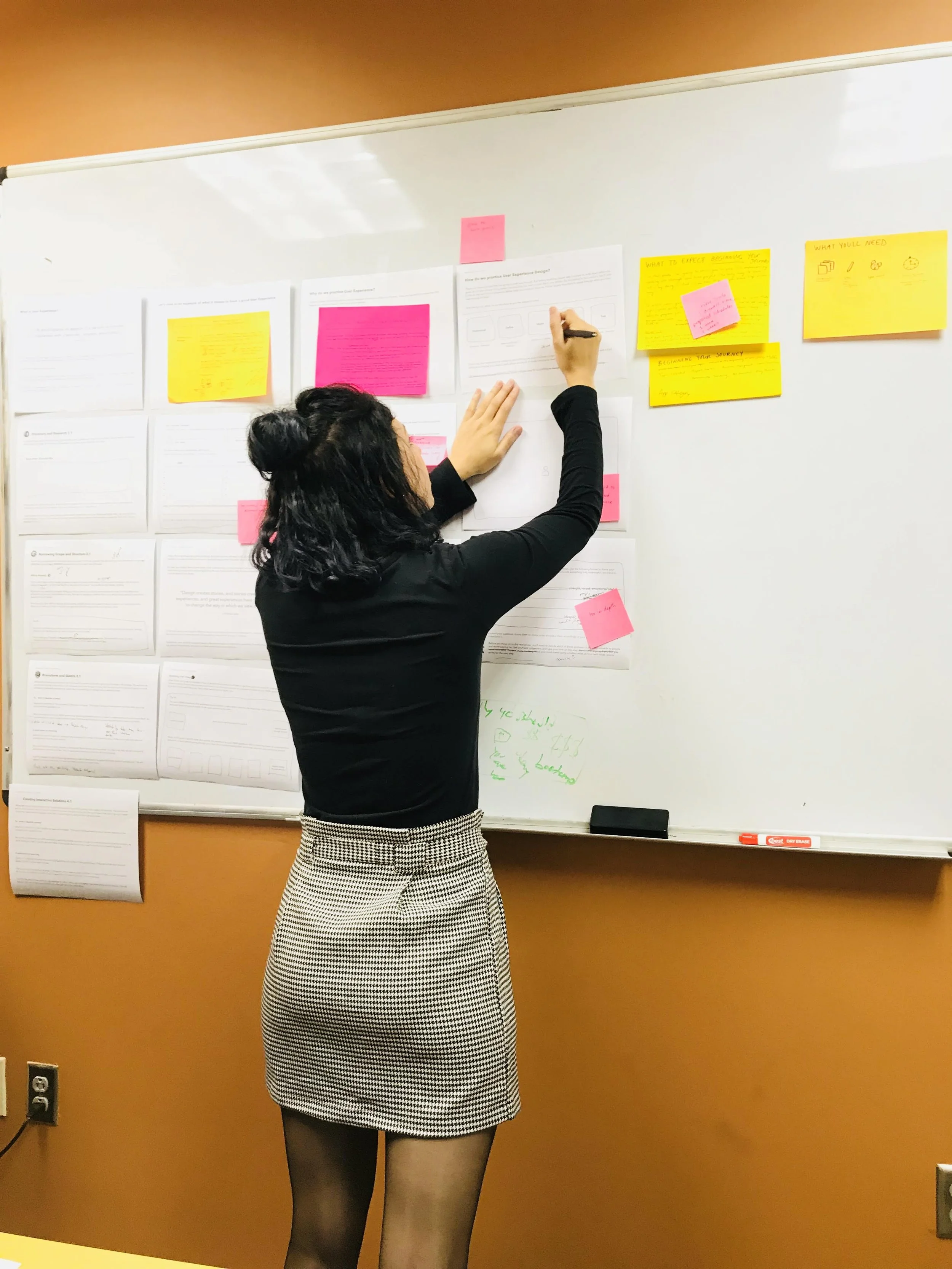
I facilitated stakeholder workshops using information hierarchy exercises, navigation planning, and content prioritization to understand what people thought was important and what wasn’t.
The existing site had accumulated a lot over time. Together, we pulled it apart and asked some deceptively simple questions:
What needs to stay?
What can go?
What are students actually looking for?
Where would they expect to find it?
By the end of the workshops, I had transformed those conversations into concrete UX deliverables and the beginnings of a much leaner first draft of information architecture.
THEN I CHECKED THE DATA
I used two years of Google Analytics data to study traffic patterns, popular pages, referral sources, and how people were navigating the existing Admissions site.
One pattern stood out.
Some of Colby’s most important admissions content was being found through Google searches rather than through the website’s own navigation. Google was basically doing a better job navigating the Admissions site than the Admissions site.
That gave us a clear problem to solve.
I paired the analytics with a survey running on the existing website, allowing us to hear from real visitors while they were actively using it. Together, the qualitative research, survey responses, and behavioral data helped us separate assumptions from actual user needs.
ASKING THE FRESHMEN
We also wanted to hear from people who had just survived the process.
I facilitated in-person research sessions with groups of first-year students, asking them to reflect on their admissions journey and what information would have made the transition to Colby easier.
Their feedback helped us look beyond simply getting someone to submit an application. The website needed to support the larger journey from prospective student to applicant to newly enrolled student.
Those sessions helped validate our emerging hierarchy and exposed places where institutional language and student expectations didn’t quite line up.

Also at the donut table was a one page survey asking generic questions on skin care purchase habits. A member of our team hung around the table and made casual conversation in asking people if they’d be willing to fill it out, and every single person was glad to do so. “Free donuts and coffee.. Sure I'll fill out a quick survey!”
Human curiosity did the rest. All survey participants wanted to know more about why we were asking skin care questions and volunteered to continue to the product testing phase.
REAL TIME FEEDBACK
PRODUCT TESTING

Testing of the actual skin care product set out to validate if people liked the product once they felt a real application of it. Leading this part of the test I was very careful in the way I asked and allowed people to interact with the product. I took participants back in groups of 3-5 people and led them to a table that had the skin care product and all ingredients present. I briefly explained to them what we would be doing, asked for any allergen concerns, and instructed them to begin testing the product.
The test involved each participant physically squeezing a small amount of product on the back of their hand while providing us with stream of consciousness thoughts as to what they were feeling.
I was in the present moment with them talking them through the product and asking prompting “why” and “can you explain more” questions. During this part of the test we had 2 Wily team members unobstructedly recording feedback and notes while I interacted with people.
CONTAINER TESTING
The next part of the test set out to validate the type of container participants would be most likely to buy the product in, and why. The next table was set out with different skin, face, and hair products I happen to find in my bathroom. Ranging from large to small, squeezable to glass, we had every common container represented.
Before asking people which container they’d like to use this particular skin care product out of, I first asked people to take a look at the products and to verbalize any general thoughts.
The most impactful piece of behavioral evidence at this stage was watching which container they picked up first. Each participant gave detailed feedback as they picked up products and put them down. Most of which fell into the following categories:
Travel size is a plus
Rubber wont break in the shower
If it looks expensive, it’s probably high quality
Attractive branding
Going through this phase of the test I also wanted to validate a key part of the user journey that we were still in the dark about; where people intended to use this product. On the go? In the shower? At the sink?
This is where our fly-on-the-wall team members popped in to introduce themselves and take the them through an exit survey while I switched my attention to conduct testing with the next group of participants. The exit survey prompted a few final thoughts and offered a discounted amount of the product in exchange for a 1-week diary study. Seven people signed up!
RESULTS
The last thing to do was analyze test feedback to organize groups and identify themes. By the end of the testing day we’d all felt like we knew exactly which direction to proceed from gleaming huge insights from potential customers. The results ended in a team consensus on the container, early adopter price point, and usage use case.
FINAL THOUGHTS
My prototyping and testing direction was my largest contribution to the Design Sprint. The startup went on to self organize the diary study and initial product launch. The product successfully sold out in its first debut at the winter Mistletoe Market, only a few short months after our sprint.